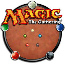
These three images are logos for Magic The Gathering. As you can see all of them make use of some combination of yellow, orange and brown these three colors give a sense of rustic adventure to the images and hint at deeper meanings. On the far right image colored circles and use value to give a sense of depth to the image. the colors used in these circles, though brighter than the orange-brown surrounding them, are also in rather subdued tones giving them the same sense of oldness and meaning as the rest of the image. In the center image the gold background gives the image a sense of rarity which draws the viewer to want "it" maybe without even knowing what "it" is. The black M logo draws the eye and gives a strong sense of importance. In the far left logo gray shading around the letters help the logo pop out at the viewer and contrast from its white background.
If someone lightened the colors in these images it would give the product a lighter, more upfront feel. This may cause the viewer to lose interest or not look deeper into the product. Also without the warm colors and black the product might lose its look of tradition and importance that stands out in the current logos.
0 Comments
|